Essential life. Essential resource. Essential energy.
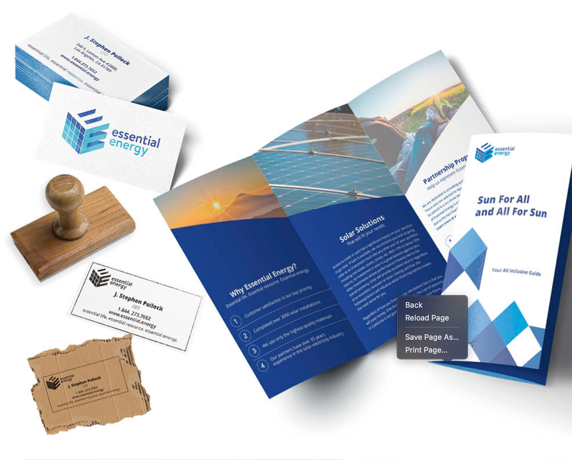
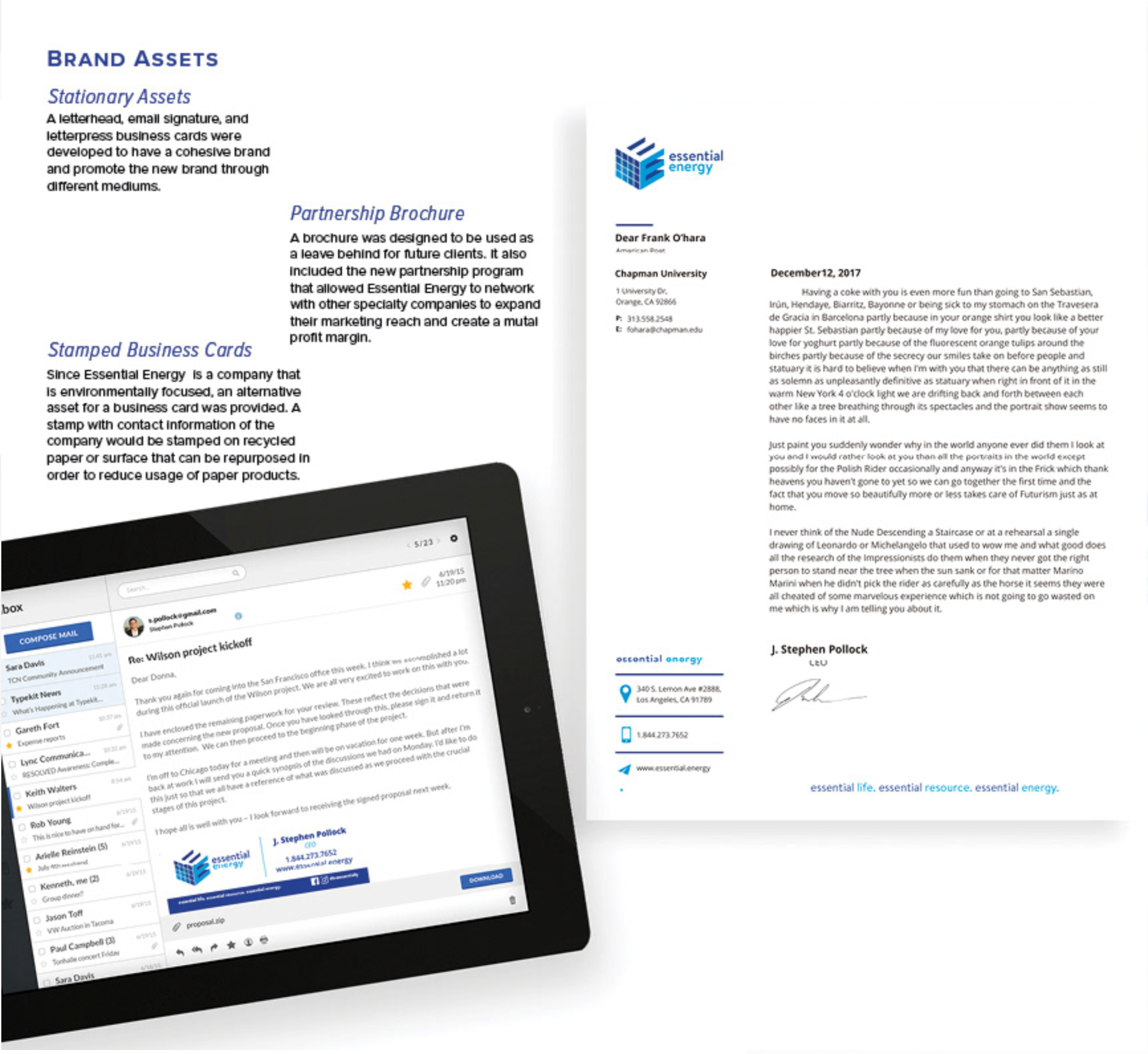
For the past several years, Essential Energy operated as ASE Solar Solutions, completing over 3,000 solar electricity installations and specializing in niche markets such as small nonprofits and religious establishments. However, ASE Solar Solutions has now rebranded itself as Essential Energy. This rebrand not only highlights the company’s ability to be innovative, flexible, and trustworthy while providing the highest quality of service, but also incorporates a fresh visual identity. The new graphic design elements, including a modern logo, updated color palette, and cohesive branding materials, emphasize Essential Energy’s commitment to excellence and its forward-thinking approach.
Collaborators: Ivana Orozco | Emily Suh | Brooke Foy | Megan Chovanec
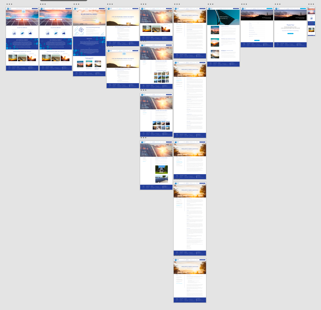
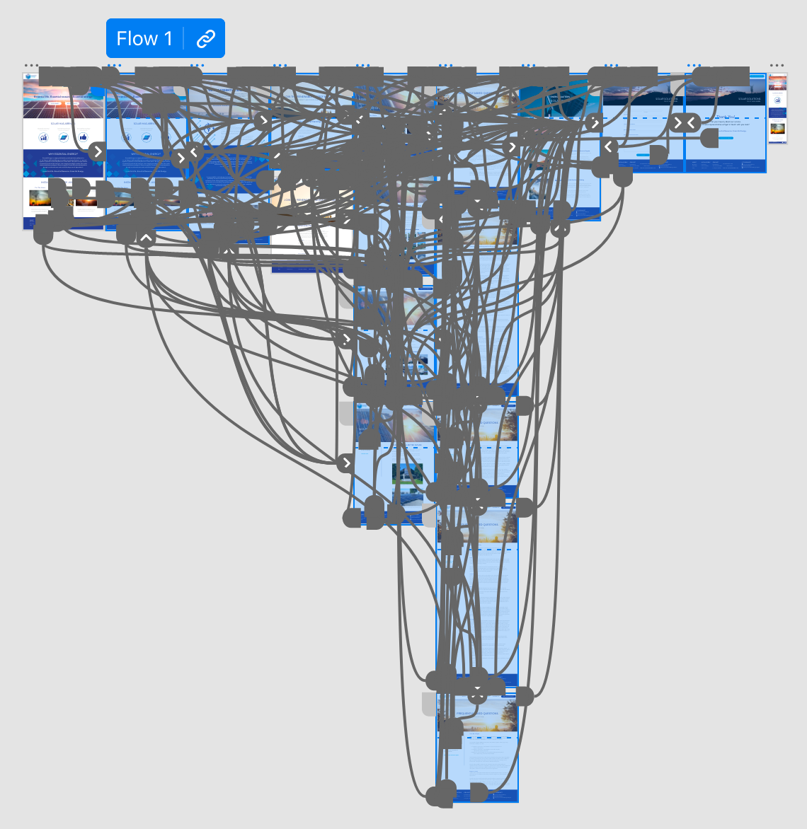
Adobe XD High-Fidelity Prototype
Essential Energy Brand Assets
Essential Energy Case Study:
Essential Energy promises to be honest, transparent and to empower people to engage with the energy they consume. Currently, most of Essential Energy’s clients are small churches and nonprofits. These clients want to convert to solar energy because they are able to save money on their energy bills, it is a steady investment for both residential and commercial spaces and solar energy systems are durable and long-lasting. With the new rebrand, Essential Energy wants to develop an advocate partnership program that would allow industry professionals to personally educate new potential clients on the benefits of going solar. After gaining a greater understanding of Essential Energy’s current clients and how solar energy works, it is clear that the primary goal of the rebrand is to gain the trust of potential new clients and partners.
Project Overview
Challenges and Goals: The primary challenge of Essential Energy’s rebranding was defining a unique voice for company. In order to appeal to the company’s demographic, it was crucial to create a visual identity that was trustworthy, approachable and professional. It is important that Essential Energy’s clients feel that they can approach the solar company and have their personal needs met. In addition, it was important to take into consideration how Essential Energy’s competitors approached their clients. Essential Energy is a smaller and more personable company and is able to deal with its clients on a one-to-one basis. This should be represented in all marketing tactics to engage with current and potential clients. It was decided during the development of Essential Energy’s rebranding that the company’s new image would be memorable and concise.
Adobe XD High-Fidelity Prototype
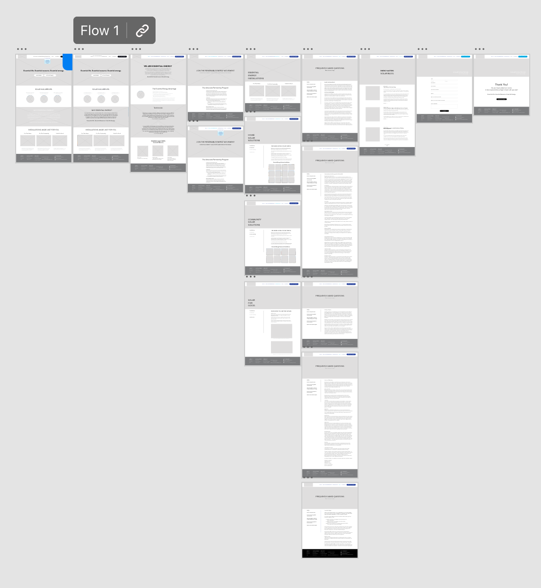
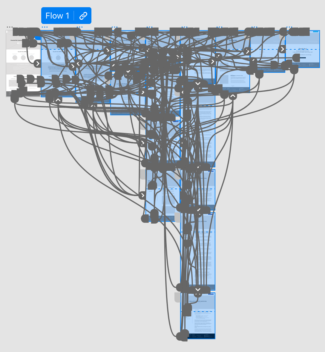
Adobe XD Low-Fidelity Prototype
User Research
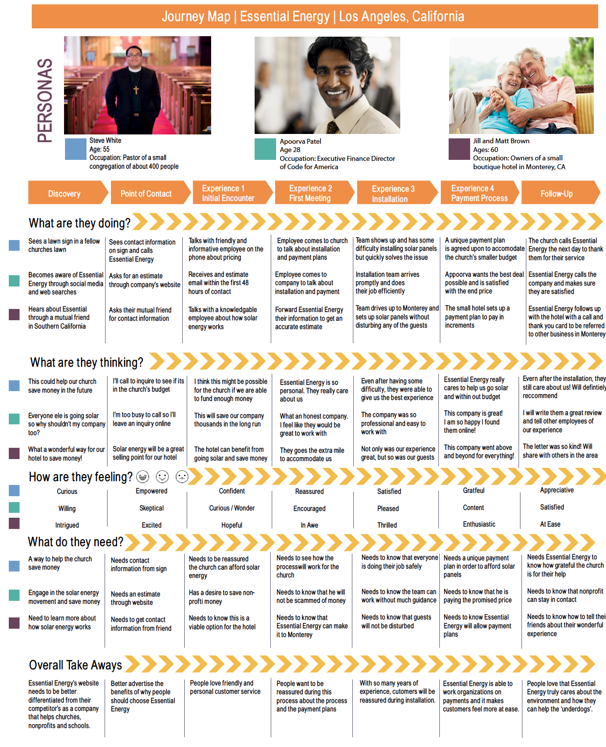
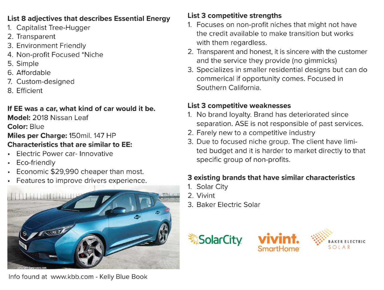
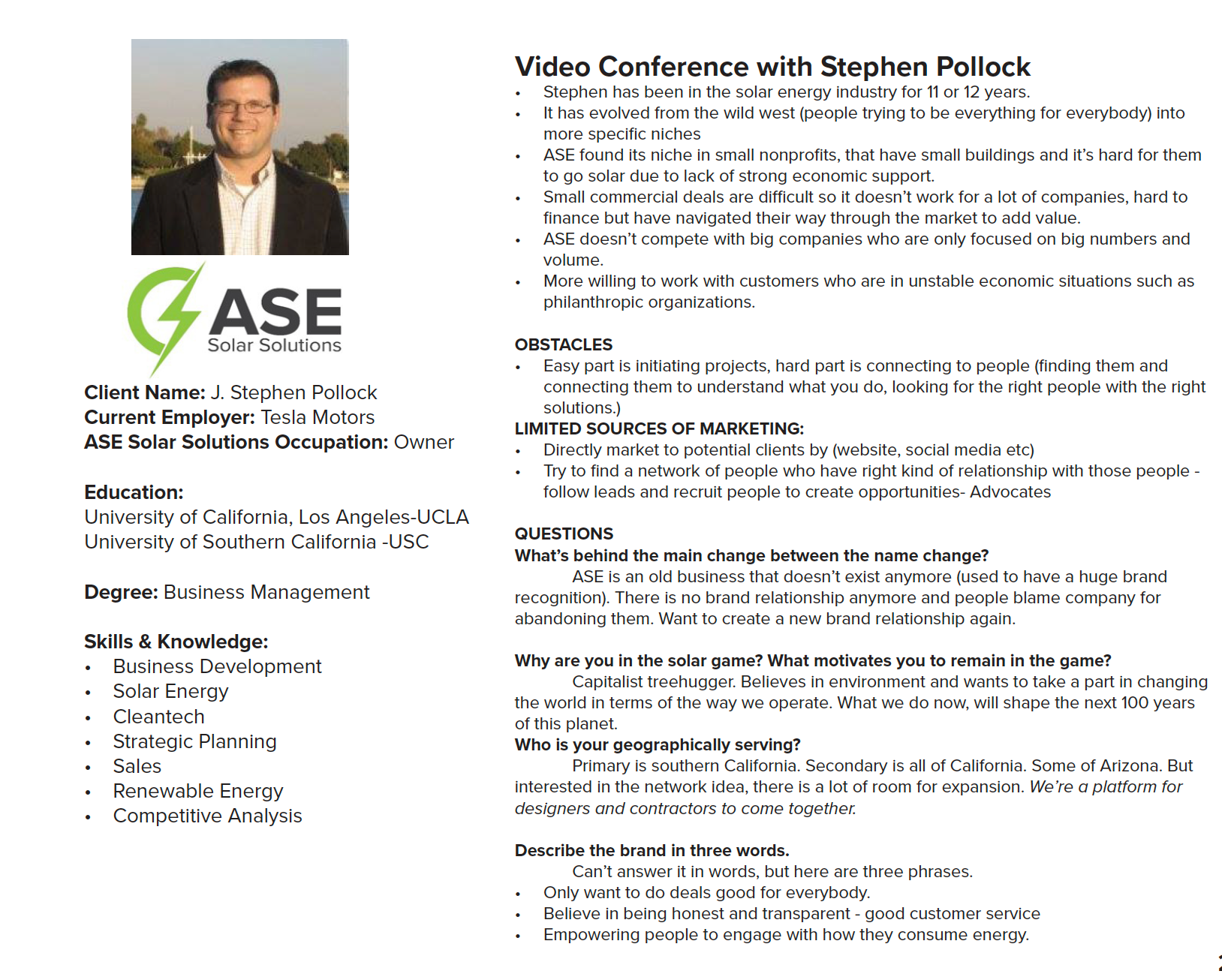
After having video conference with Essential Energy’s CEO, Stephen Pollack, we researched the company’s top competitors to see what was currently trending in the marketplace. After gaining insight into the solar energy industry, we began developing a journey map based on three separate personas that could be potential clients of Essential Energy. The three different personas included an Essential Energy partner, as a Nonprofit leader and a small business owner. This helped me understand what each persona would take away from the Essential Energy brand. By doing this I was able to grasp how to make the Essential Energy brand friendlier and more trustworthy for these potential partners and clients. After completing the journey map I moved on to developing style boards that would help me begin my design journey.
Journey Map, Brand Research, Interview, and Visual Board
